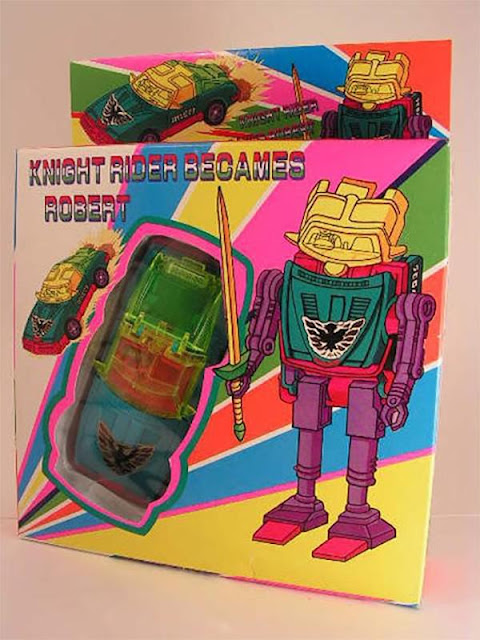
I saw this abomination on The Chive, in a post about bad toy knockoffs. It looks like it's supposed to be a Transformer-style toy, but the colors and packaging are hilariously crappy.
The name says, in Mexican/Italian colors, "Knight Rider Becames Robert" instead of what I believe should be, "Knight Rider Becomes Robot". This, along with the crazy overall neon color scheme and primitive graphics, makes for a memorably bad example of graphic design.


No comments:
Post a Comment